View


Guomin Fish
Guomin Fish
Guomin Fish
Guomin Fish
Guomin Fish


Research indicated that most packaging in major channels (like PX Mart) lacked a human touch. Guomin Fish had an opportunity to emphasize local fisheries, cultural heritage, and the value of fresh seafood.
Tags:
Branding
Packaging

Challenge
Guomin Fish (國民魚鋪) boasts an advanced rapid-freezing technology but needed a brand identity that felt warm and inviting for the mass market, rather than coldly high-tech.
Solution
We designed a simple, welcoming logo and paired it with hand-drawn fish illustrations reminiscent of an old encyclopedia. A key packaging feature is a “window” cutout that showcases the product’s freshness at a glance. Using a calm blue palette evokes the sea while instilling trust, and concise text stories highlight fishermen’s culture and respect for marine resources.
Outcome/Results
Guomin Fish successfully entered multiple high-end supermarkets and attracted international interest in its freezing technology. By blending an approachable design with cutting-edge innovation, the brand now stands out as both authentic and advanced, resonating with consumers seeking fresh, culturally rich seafood.

Prints

Element

Element
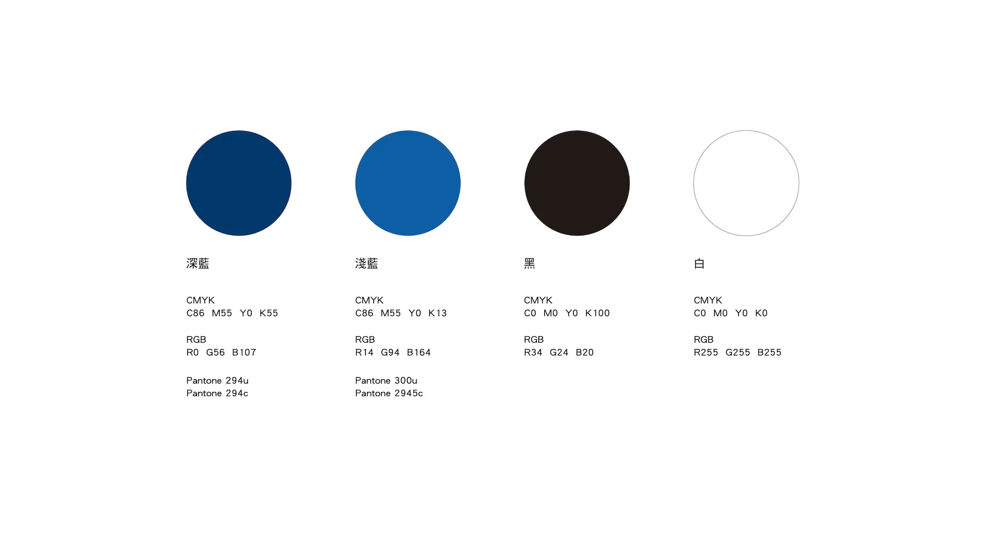
Colors

Name Card

Name Card

Packaging

Packaging

Packaging

Visit Web:
Prints
Element
Element
Colors
Name Card
Name Card
Packaging
Packaging
Packaging
Additional Videos
@2025 BOOM Business Design Inc. - All rights reserved
